If you look at the way mass-market fashion brands try to sell clothes right now, their entire business model relies on the illusion of variety. They want you to believe that a functional wardrobe requires an endless, hyper-saturated wheel of colors—a different trend shade for every mood, every week, and every aesthetic micro-movement that flashes across your social feed.
But when you’re navigating a demanding graduate schedule, running between digital strategy presentations, and managing a tiny apartment with limited closet space, variety isn't a luxury. Variety is just visual noise. It’s the primary reason people stand in front of a closet packed with clothes at 7:45 AM and feel like they have absolutely nothing to wear.
As someone finishing up a degree in fashion marketing, I’ve become entirely obsessed with the concept of visual efficiency. Last week, I decided to run a strict styling experiment: I locked my entire wardrobe into a rigid, four-color matrix for seven days straight. No pastels, no bright primaries, and no stark, clinical whites. I restricted myself entirely to butter cream, washed navy, fog gray, and one very specific, earthy forest green. The result wasn't boring; it was liberating. By removing color choice from the morning equation, I didn't just save time—I forced the focus of my outfits entirely onto texture, proportion, and weight. Here is how one palette carried me through a full week of real life. It’s not that deep. But also kind of.

The Four Pillars of the Palette
The secret to making a restricted palette work across a full week lies in choosing shades that share the same visual frequency. They need to be "foggy neutrals"—colors with a heavy undertone of gray or brown that allows them to blend together naturally without creating a sharp, distracting visual break across your body.
The Foundation: Butter Cream: Pure, stark white light can look clinical and unyielding under natural daylight. By shifting my baseline to a warm, antique butter cream or unbleached oatmeal, I introduced an automatic layer of depth. It acts as a soft reflector for the face, framing features with an organic warmth.
The Anchor: Washed Navy: This isn't the sharp, high-contrast navy of a formal corporate suit. It’s a faded, soft navy that carries a slight slate-gray tint—the color of a cotton rugby shirt that has been through the wash fifty times. It provides the necessary structure and darkness without looking rigid or stuffy.
The Binder: Fog Gray: Heather gray and soft slate function as the ultimate visual glue for this system. Whether it’s a loose-fitting pair of wool trousers or a vintage athletic crewneck sweatshirt, fog gray bridges the gap between classic tailoring and absolute casual ease.
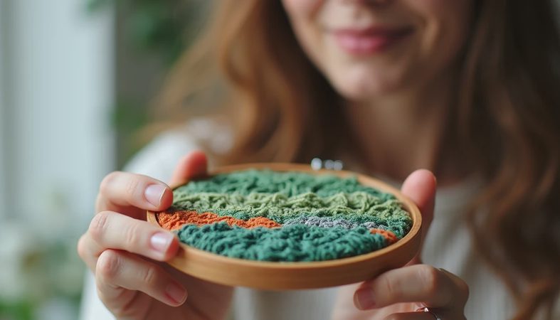
The Accent: The Specific Green: This is the wildcard of the matrix. It isn't a bright kelly green or a neon olive; it is a deep, muted forest green—the color of old varsity pennants and moss-covered stone. It introduces a subtle, scholarly weight that anchors the other three shades perfectly.
The Seven-Day Matrix in Real Life
Because every single tone in this matrix is already in conversation with the others, getting dressed became a game of modular assembly. Here is how the week naturally sorted itself out across different academic and daily landscapes:
The Monday Morning Presentation Rush
The Vibe: Sharp structure, zero stress.
The Setup: I layered an oversized fog-gray herringbone wool blazer over a simple, washed navy cotton tee. For the bottom, I went with relaxed cream-colored cotton trousers that draped beautifully over my dark espresso-brown leather loafers.
The Result: The outfit looked highly intentional from the front of the classroom, but because the blazer shoulders were dropped and the trousers were loose, I felt entirely at ease while presenting my brand deck.
The Wednesday Library Grind
The Vibe: Emotional architecture.
The Setup: I spent the entire afternoon buried in research papers in a drafty corner of the university library. I built a protective shell out of the accent color: a thick, heavy forest-green cable-knit wool sweater, layered loosely over a washed navy rugby shirt with an unbuttoned, rumpled cream collar popping out over the top. I paired this with my favorite relaxed straight-leg denim.
The Result: When you're sitting in an uncomfortable wooden chair for four hours, the literal physical weight of a heavy knit acts like a psychological safety net. It keeps you warm, it holds its shape, and it completely blocks out the distractions of the room.

The Friday Advisor Meeting
The Vibe: Casual, collected, ready for the weekend.
The Setup: For creative direction office hours, I went entirely low-contrast. I wore a faded fog-gray athletic crewneck sweatshirt over an untucked white oxford shirt, letting the curved hem peek out at the bottom. I threw my oversized forest-green sweater over my shoulders, tying the sleeves loosely across my chest, and wore relaxed gray chinos on the bottom.
The Result: It was a look built entirely on shades of gray and green, completely free of contrast, feeling thoroughly lived-in and intelligent.
Shifting Focus From Color to Soul
The absolute best part about this experiment was what happened when I stopped worrying about whether my colors matched. When your color wheel is permanently balanced, you suddenly start noticing the actual soul of your garments. You notice the beautiful, dull patina developing on the leather of your penny loafers. You notice the way a heavy poplin shirt collar ruffles up perfectly against a wool lapel, or the way a thick, slouched cotton sock breaks the rigid line of a trouser hem.
Yesterday afternoon, as I was wrapping up a long digital marketing workshop at a local coffee shop, I looked down at my sleeve. I was wearing my favorite forest-green knit over a cream oxford shirt. Coco had spent twenty minutes sleeping on the sweater before I left the apartment, and she had left a tiny, unmistakable cluster of grey tabby fur right along the cuff.
A pristine, immaculate outfit is a fragile performance that we have no interest in maintaining in 2026. I didn't look for a lint roller; I didn't try to brush it away. The grey fur blended seamlessly into the heathered texture of the wool anyway.
Stop letting fashion brands convince you that you need to buy a new color every week to have personal style. Clear out the visual noise. Pick four tones that carry historical weight, natural texture, and absolute comfort, and let them become your daily armor. Let your layers slouch, let your collar stay unbuttoned, and let your uniform work for your life.