
If you ask anyone to close their eyes and picture the classic color palette of traditional American collegiate style, their brain will instantly map out a very specific, high-contrast matrix. They will see sharp, primary red stripes next to crisp, starched white collars. They will see high-saturation kelly green, canary yellow, and a deep, aggressive navy blue that looks like it was borrowed straight from a military naval academy.
For decades, the preppy style manual treated color like a megaphone. It was designed to be loud, bright, and instantly recognizable across a manicured golf course or a country club terrace. The colors didn't apologize, and they certainly didn't blend in.
But walk onto a university campus or take a stroll through Brooklyn in 2026, and you’ll notice that the entire visual landscape has quietly shifted. The neon pinks, stark whites, and harsh primary contrasts are officially dead. In their place is a far more gentle, introspective, and sophisticated spectrum of tones that I like to call "foggy neutrals." As someone finishing up a graduate degree in fashion marketing, I spent last week analyzing color trend data for a visual communication seminar. What I found isn't just an aesthetic whim; it’s a psychological response. In a world that feels overwhelmingly loud and digitally frantic, our eyes are naturally craving shades that feel calm, historic, and kind to look at. Preppy Revival 3.0 is built on this softer, muted foundation: butter cream, mist blue, washed gray, and the subtle warmth of weathered leather. It’s not that deep. But also kind of.
The Semiotics of Muted Tones: Why Sharp Contrast Collapsed
In fashion theory, color is never just a passive choice; it carries a heavy load of social meaning. The original high-contrast prep palette (Preppy 1.0) was about projecting an image of absolute neatness and flawless discipline. A stark white shirt required a life without messy labor; a brilliant primary navy blazer demanded constant dry cleaning and impeccable grooming.

When the style returned in the 2010s (Preppy 2.0), it turned up the volume even higher with neon pastels—bright corals, neon greens, and hot pinks—designed to flash vividly on early social media feeds. It was about performance, consumerism, and being noticed.
But Preppy 3.0 completely rejects that performance. We aren't trying to look rich, and we certainly aren't trying to match a corporate dress code. By stripping away the high contrast, we are transforming the aesthetic from an outward performance of status into an internal uniform of comfort.
Let's look at the exact chemical transformation of the modern color wheel to see how these shades interact:
From Stark White to Butter Cream/Oatmeal: Pure, bright white light can look clinical and incredibly rigid under natural daylight. By shifting your baseline to butter cream, ivory, or unbleached oatmeal, you instantly introduce a warm, antique depth to your outfit. It looks like a garment that has lived a life, carried memories, and survived a few cozy afternoon library sessions.
From Primary Navy to Washed Slate Blue/Mist Blue: Instead of an aggressive naval navy, the modern soft uniform leans into blues that have been softened by gray undertones. A mist-blue or washed-slate polo shirt looks calm, scholarly, and coordinates effortlessly with pre-existing denim without creating a harsh visual break at the waistline.
The Integration of Washed Gray: Faded heather gray and soft slate gray act as the ultimate binders for Preppy 3.0. A washed-gray crewneck sweatshirt or relaxed wool trousers serve as a casual neutral ground that prevents your outfit from ever looking like a vintage costume. It bridges the gap between classic tailoring and athletic leisure.
The Tonal Transition Matrix
To make this actionable for your daily morning routine, let's break down how swapping out traditional high-contrast pairings for modern foggy neutrals changes the entire mood of an everyday campus outfit.
Traditional Preppy Outfit (The Costume) | Preppy 3.0 Alternative (The Soft Uniform) | The Visual Communication Shift |
Crisp white oxford shirt + sharp navy blazer + bright golden khaki chinos. | Oatmeal linen shirt + oversized charcoal gray tweed blazer + washed-gray wide-leg trousers. | Shifts the look from a corporate internship suit to an effortless, creative academic silhouette. |
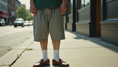
Kelly green polo shirt + white athletic shorts + pristine white tennis shoes. | Mist-blue pique polo + relaxed gray sweat-shorts + scuffed brown leather loafers with slouched socks. | Neutralizes country-club pretense; introduces athletic ease and structural weight. |
Primary red crewneck sweater over a starched collar + tight blue denim. | Butter-cream heavy cable-knit sweater left loose over a faded denim button-down + relaxed dark denim. | Emphasizes physical texture, warmth, and a lived-in quality rather than a loud trend. |

Living in the Low-Contrast Landscape
The absolute best part about this new color story is its incredible modularity. When your wardrobe exists entirely within the world of foggy neutrals, everything matches by default. You don't have to spend twenty minutes standing in front of your mirror wondering if your shirt clashes with your jacket or if your shoes are too loud for your pants.
Yesterday morning, I was running completely behind schedule for a digital marketing group workshop. I grabbed a soft mist-blue polo shirt, threw my favorite oversized oatmeal wool cardigan over my shoulders, and slid into a pair of relaxed, washed-gray straight-leg trousers. I didn't look like I had spent an hour agonizing over a style manual; I just looked balanced, comfortable, and ready to work.
As I was rushing out the door with my canvas tote bag, Coco made a playful dive for my ankles, leaving a few strands of grey tabby fur along the ribbing of my right cream sock. A pristine outfit is a stressful outfit, and we are completely done with stress in 2026. I didn't even reach for a lint roller. The grey fur blended seamlessly into the washed-gray textile of my trousers anyway.
Stop trying to make your clothes scream for attention with high-contrast primary colors. Drop the neon, step away from the starched whites, and let your palette soften. Find the beauty in the foggy neutrals, let your silhouettes breathe, and build a uniform that lets you live completely on your own terms.


Letters
No letters yet — be the first to write.